Rocket League Logo: How Did It Change Over the Years?
Today we come to you with a light and fun topic that will give some insight into the history of Rocket League. We will discuss the game’s logo and the changes it has undergone over the years. This is the kind of knowledge you’ll be able to show off on Discord, at a party, or via chat during an intense match in RL! Read what we have prepared for you and deepen your expertise in Rocket League.
A Brief Overview of Rocket League’s History
Rocket League is one of the world’s most popular games and was originally developed by a studio called Psyonix. It is a sequel to Supersonic Acrobatic Rocket-Powered Battle-Cars, a title that appeared on the market at the turn of 2008/2009. Both versions revolve around two things – cars and soccer – but RL is by far the more elaborate one, which is why it has conquered the gaming market.
The game in its current version was launched in 2015 and was initially available only on PlayStation 4 and Windows. Currently, Rocket League can be played on all major platforms, that is, also on Xbox and Nintendo Switch. In 2019, Psyonix was bought out by Epic Games, a company that had already been working closely with the developer for several years before to support the creation of the Unreal Engine. The transformation has only positively affected the game’s popularity, as it has been added to the official Epic Games Store.
How Popular Is the Game Currently?
As we have already mentioned, Rocket League has won the hearts of gamers from all over the world. According to 2022, nearly 90 million people play it every month. That’s about 6 million every day, which makes it hard to deny its impact on the community. What’s more, the title has also conquered the eSports world. The Rocket League Championship Series (aka RLCS) is one of the most important events in competitive gaming, featuring some of the largest eSports organizations in the world. That’s not surprising, given that prizes can total more than $2 million. Who wouldn’t want to grab that kind of money?
Rocket League Logo Over the Years
From the very beginning, the Rocket League logo has played an important role in the brand’s development. That little car bouncing a ball right next to the game’s title quickly attained iconic status in the gaming community. It could be found on boxes, in the item shop, as well as in all kinds of collaborations. The shield shape was also adapted by RLCS and thus made its way into the eSports world as well. Today the logo looks completely different, but its iconic status has not changed at all. With that said, let’s go through all the modifications that took place over the past decade.
Supersonic Acrobatic Rocket-Powered Battle-Cars
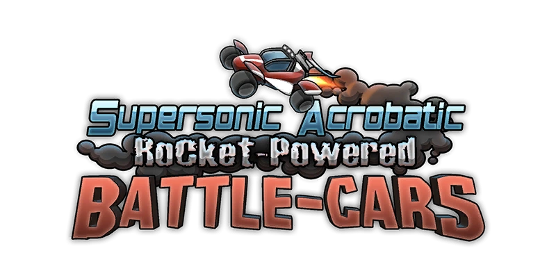
For context, we also decided to throw in the SARP logo. Theoretically, it’s not exactly the same game, but many people see Rocket League as its sequel, so we thought it was worth showing what the predecessor version looked like.
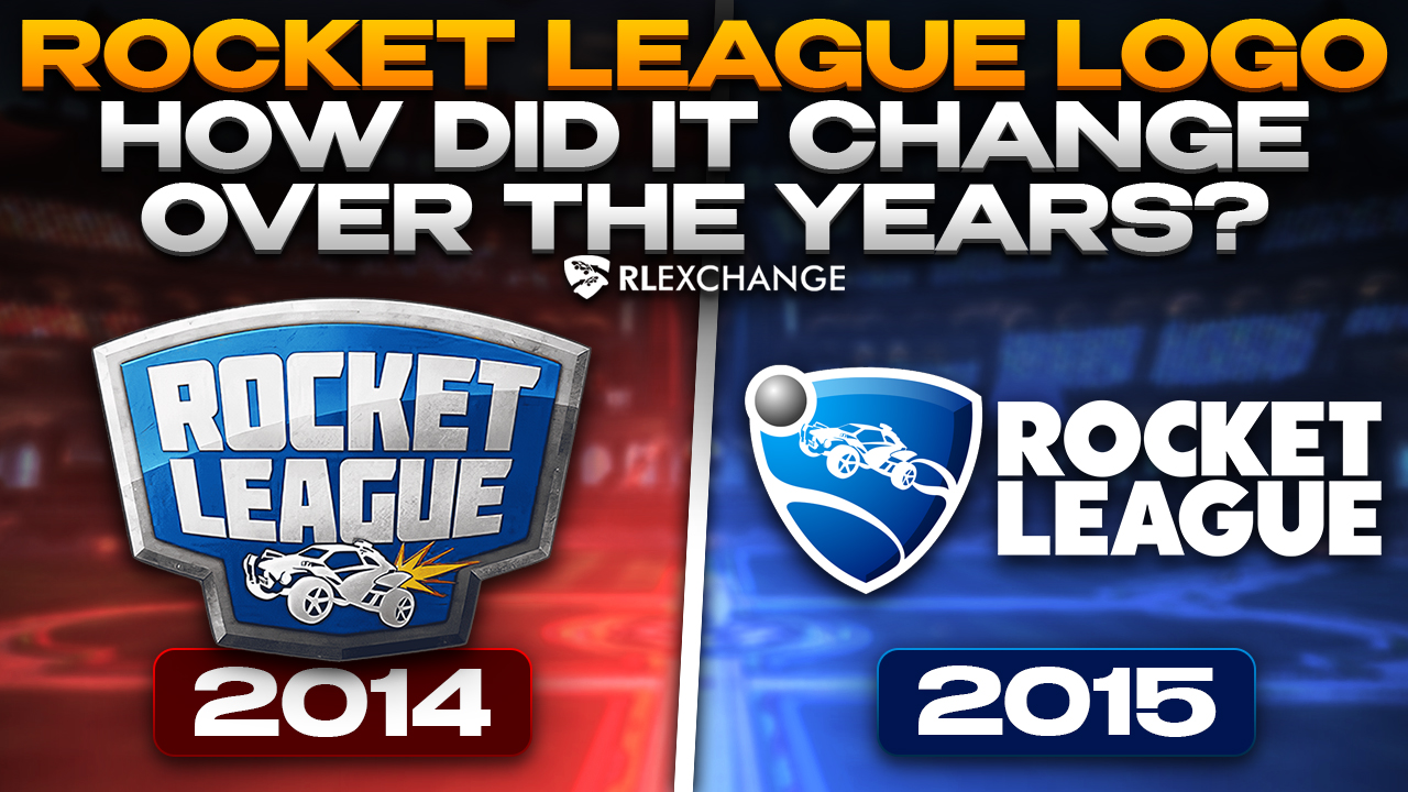
2014 – 2015
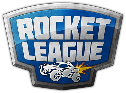
Admittedly, this version of the logo was only in effect for a year, but still, most players are well familiar with it. It initiated everything we still know and love about Rocket League today. It’s where the iconic blue color, the shield shape and the little car first appeared. While this logo may have only briefly accompanied the game, it still has a special place in our hearts.
2015 – 2020

This is the version that everyone knows for sure. It’s the iconic logo that accompanied the game for the longest time – 5 years. In 2015 the developers decided to separate the shield with the car from the game’s title, and thus the idea of bold letters spelling out “Rocket League” was born. All those who came to the RL community at a key moment of its development first came into contact with this very logo. In terms of the game’s history, this is probably the version with the most significance.
2020 – Now
![]()
And finally, the logo that has accompanied us from 2020 until this very day. It is by far the simplest and most minimalist version. One can say that Epic Games followed the trends of contemporary typography, and this is how the present Rocket League logo was created. Admittedly, the move made sense, because at this point, with 90 million playing RL per month, the game’s title already speaks for itself.
What About Other Rl-Related Logos?
As we have already mentioned, the Rocket League universe has grown significantly over the years. Following the dynamic development of the eSports scene and the game’s arrival on new platforms, Psyonix, and later also Epic Games, had to come up with new logos to accompany players in their various endeavors. That’s why today we’re also presenting you the RLCS logo and the Rocket League Side Swipe logo (which is the mobile version of the game) to show you what other ideas the developer came up with.
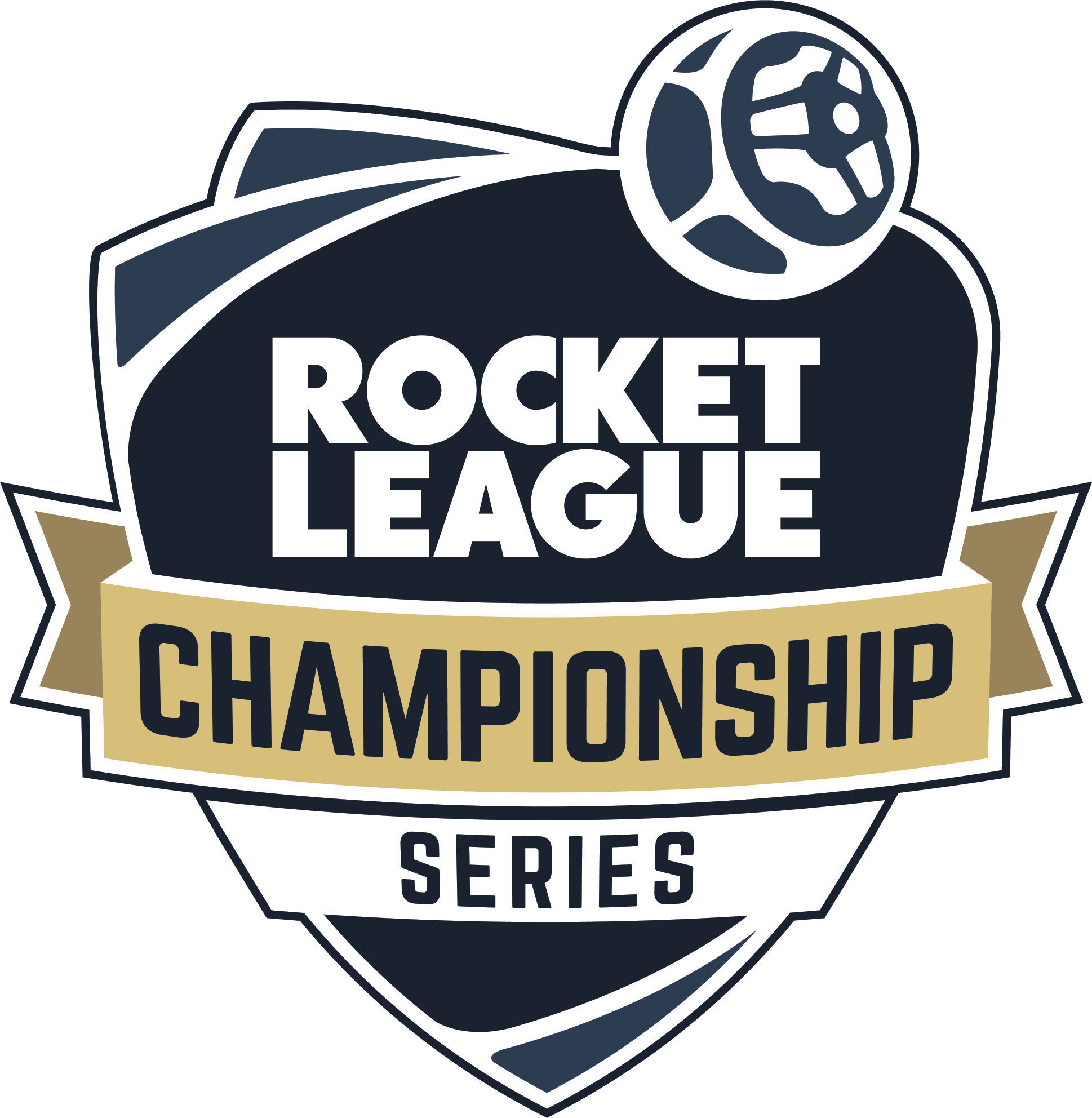
Rocket League Championship Series
Rocket League Side Swipe

Conclusions
We hope you enjoyed this brief walk through the Rocket League timeline and that it brought you a little closer to the development of the game. A logo is the most important part of any brand, and this particular one has become a major symbol for many players from all over the world. Hopefully, it also means something to you.